[Fuente: https://developer.android.com/develop/ui/views/launch/splash-screen]
[Fuente: https://developer.android.com/training/wearables/apps/splash-screen]
Starting in Android 12 (API SDK 31), the SplashScreen API lets apps launch with animation, including an into-app motion at launch, a splash screen showing your app icon, and a transition to your app itself. A SplashScreen is a Window and therefore covers an Activity.
The splash screen experience brings standard design elements to every app launch, but it’s also customizable so your app can maintain its unique branding.
In addition to using the SplashScreen platform API, you can also use the SplashScreen compat library, which wraps the SplashScreen API.
How the splash screen works
When a user launches an app while the app’s process isn’t running (a cold start) or the Activity isn’t created (a warm start), the following events occur:
- The system shows the splash screen using themes and any animations that you define.
- When the app is ready, the splash screen is dismissed and the app displays.
The splash screen never shows during a hot start.
Elements and mechanics of the splash screen
The elements of the splash screen are defined by XML resource files in the Android manifest file. There are light and dark mode versions for each element.
The customizable elements of a splash screen consist of:
- the app icon
- icon background
- window background:
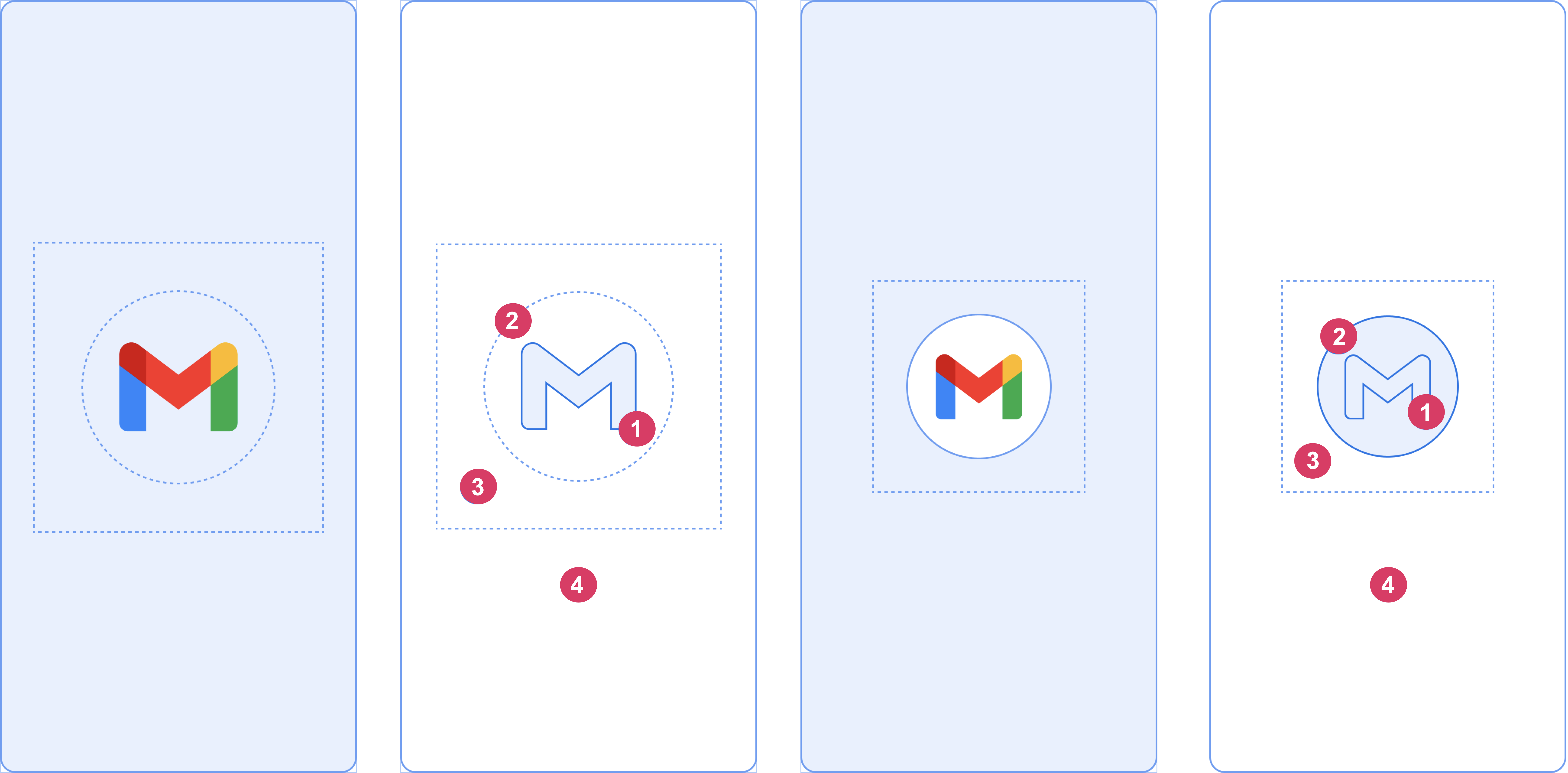
Consider the following elements, shown in figure 2:
1 The app icon must be a vector drawable. It can be static or animated. Although animations can have an unlimited duration, we recommend not exceeding 1,000 milliseconds. The launcher icon is the default.
2 The icon background is optional and useful if you need more contrast between the icon and the window background. If you use an adaptive icon, its background is displayed if there is enough contrast with the window background.
3 As with adaptive icons, one-third of the foreground is masked.
4 The window background consists of a single opaque color. If the window background is set and is a plain color, it is used by default if the attribute isn’t set.
Splash screen dimensions
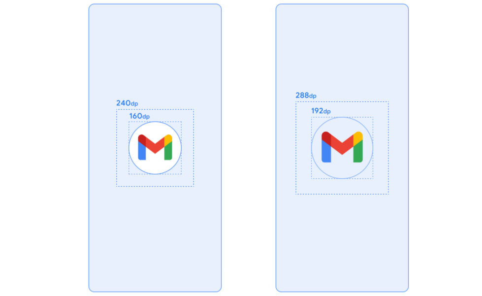
The splash screen icon uses the same specifications as adaptive icons, as follows:
- Branded image: this must be 200×80 dp.
- App icon with an icon background: this must be 240×240 dp and fit within a circle 160 dp in diameter.
- App icon without an icon background: this must be 288×288 dp and fit within a circle 192 dp in diameter.
For example, if the full size of an image is 300×300 dp, the icon needs to fit within a circle with a diameter of 200 dp. Everything outside the circle turns invisible (masked).
Splash screen animations and the launch sequence
Additional latency is often associated with launching an app on a cold start. Adding an animated icon to your splash screen has obvious aesthetic appeal and provides a more premium experience. User research shows that perceived startup time is less when viewing an animation.
A splash screen animation is embedded within the launch sequence components, as shown in figure 4.
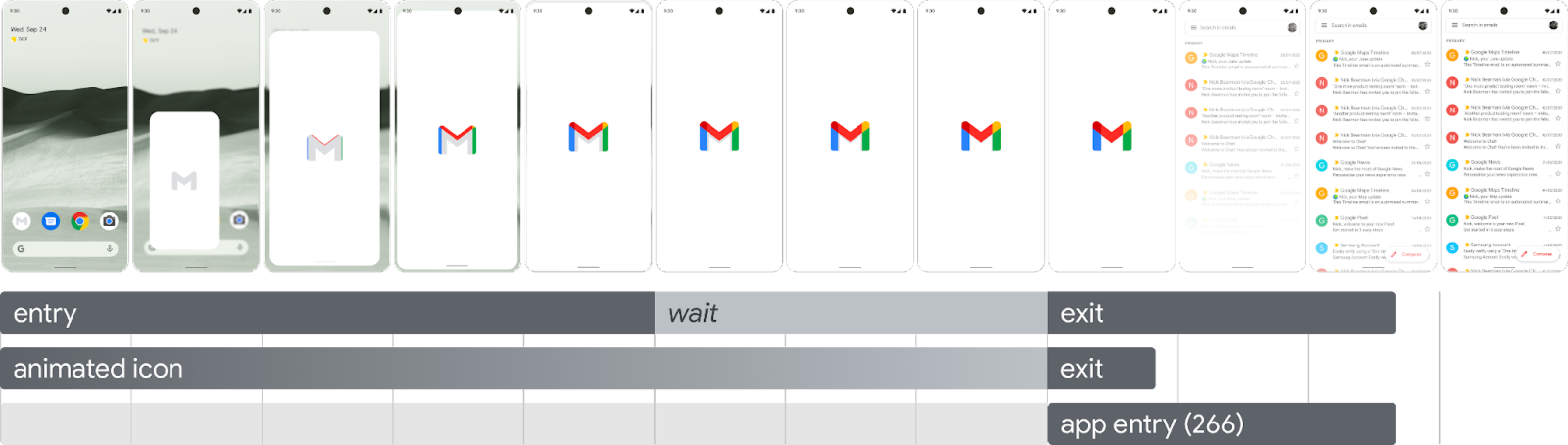
- Enter animation: this consists of the system view to the splash screen. It is controlled by the system and isn’t customizable.
- Splash screen (shown during the “wait” portion of the sequence): the splash screen can be customized, letting you supply your own logo animation and branding. It must meet the requirements described in this page to work properly.
- Exit animation: this consists of the animation that hides the splash screen. If you want to customize it, use the
SplashScreenViewand its icon. You can run any animation on them, with settings for transform, opacity, and color. In this case, manually remove the splash screen when the animation is done.
When running the icon animation, app launch gives you the option to skip the sequence in cases where the app is ready earlier. The app triggers onResume() or the splash screen times out automatically, so make sure the motion can be comfortably skipped. The splash screen must only be dismissed with onResume() when the app is stable from a visual standpoint, so no additional spinners are needed. Introducing an incomplete interface can be jarring for users and might give an impression of unpredictability or lack of polish.
Splash screen animation requirements
Your splash screen must adhere to the following specifications:
- Set a single window background color with no transparency. Day and Night mode are supported with the
SplashScreencompat library. - Make sure the animated icon meets the following specifications:
- Format: the icon must be an AnimatedVectorDrawable (AVD) XML.
- Dimensions: an AVD icon must be four times the size of an adaptive icon, as follows:
- The icon area must be 432 dp—in other words, four times the 108 dp area of an unmasked adaptive icon.
- The inner two-thirds of the image is visible on the launcher icon, and must be 288 dp—in other words, four times the 72 dp that makes up the inner masked area of an adaptive icon.
- Duration: we recommend not exceeding 1,000 ms on phones. You can use a delayed start, but this can’t be longer than 166 ms. If the app startup time is longer than 1,000 ms, consider a looping animation.
- Establish an appropriate time to dismiss the splash screen, which happens as your app draws its first frame. You can further customize this as described in the section about keeping the splash screen on-screen for longer periods.
Splash screen resources
Figure 5. Example AVD.
Download the example starter kit, which demonstrates how to create, format, and export an animation into an AVD. It includes the following:
- Adobe After Effects project file of the animation.
- Final exported AVD XML file.
- Example GIF of the animation.
By downloading these files, you agree to the Google Terms of Service.
The Google Privacy Policy describes how data is handled in this service.
Customize the splash screen in your app
By default, SplashScreen uses the windowBackground of your theme if windowBackground is a single color. To customize the splash screen, add attributes to the app theme.
You can customize your app’s splash screen by doing any of the following:
- Set theme attributes to change its appearance.
- Keep it on-screen for a longer period.
- Customize the animation for dismissing the splash screen.
Get started
The core SplashScreen library brings the Android 12 splash screen to all devices from API 23. To add it to your project, add the following snippet to your build.gradle file:
dependencies {
implementation(“androidx.core:core-splashscreen:1.0.0”)
}
Set a theme for the splash screen to change its appearance
You can specify the following attributes in your Activity theme to customize the splash screen for your app. If you already have a legacy splash screen implementation that uses attributes like android:windowBackground, consider providing an alternate resource file for Android 12 and higher.
- Use
windowSplashScreenBackgroundto fill the background with a specific single color:<item name="android:windowSplashScreenBackground">@color/...</item>
- Use
windowSplashScreenAnimatedIconto replace the icon in the center of the starting window.For apps targeting Android 12 (API level 32) only, do the following:If the object is animatable and drawable throughAnimationDrawableandAnimatedVectorDrawable, setwindowSplashScreenAnimationDurationto play the animation while showing the starting window. This isn’t required for Android 13, because the duration is directly inferred from theAnimatedVectorDrawable.<item name="android:windowSplashScreenAnimatedIcon">@drawable/...</item>
- Use
windowSplashScreenAnimationDurationto indicate the duration of the splash screen icon animation. Setting this doesn’t have any effect on the actual time during which the splash screen is shown, but you can retrieve it when customizing the splash screen exit animation usingSplashScreenView.getIconAnimationDuration. See the following section about keeping the splash screen on-screen for longer periods for more details.<item name="android:windowSplashScreenAnimationDuration">1000</item>
- Use
windowSplashScreenIconBackgroundColorto set a background behind the splash screen icon. This is useful if there isn’t enough contrast between the window background and the icon.<item name="android:windowSplashScreenIconBackgroundColor">@color/...</item>
- You can use
windowSplashScreenBrandingImageto set an image to be shown at the bottom of the splash screen. However, the design guidelines recommend against using a branding image.<item name="android:windowSplashScreenBrandingImage">@drawable/...</item>
- You can use
windowSplashScreenBehaviorto specify whether your app always displays the icon on the splash screen in Android 13 and higher. The default value is 0, which displays the icon on the splash screen if the launching activity sets thesplashScreenStyletoSPLASH_SCREEN_STYLE_ICON, or follows the system behavior if the launching activity doesn’t specify a style. If you prefer to never display an empty splash screen and always want the animated icon to be displayed, set this to the valueicon_preferred.<item name="android:windowSplashScreenBehavior">icon_preferred</item>
Add a splash screen
If your app implements a custom splash screen or uses a launcher theme, migrate your app to the SplashScreen library, available in Jetpack, to ensure it displays correctly on all Wear OS versions.
See step by step implementation instructions on this page to learn how to add a splash screen using the SplashScreen library such that the screen meets design guidelines.
Add dependencies
Add the following dependency to your app module’s build.gradle file:
dependencies {
    implementation("androidx.core:core-splashscreen:1.1.0-alpha02")
}
Make sure you are using version 1.0.1 or higher, to get support for default Wear OS dimensions.
Add a theme
Create a splash screen theme in res/values/styles.xml. The parent element depends on the icon’s shape:
- If the icon is round, use
Theme.SplashScreen. - If the icon is a different shape, use
Theme.SplashScreen.IconBackground.
Use windowSplashScreenBackground to fill the background with a single black color. Set the values of postSplashScreenTheme to the theme that the Activity should use and windowSplashScreenAnimatedIcon to a drawable or animated drawable:
<resources>
    <style name="Theme.App" parent="@android:style/Theme.DeviceDefault" />

    <style name="Theme.App.Starting" parent="Theme.SplashScreen">
        <!-- Set the splash screen background to black -->
        <item name="windowSplashScreenBackground">@android:color/black</item>
        <!-- Use windowSplashScreenAnimatedIcon to add a drawable or an animated
             drawable. -->
        <item name="windowSplashScreenAnimatedIcon">@drawable/splash_screen</item>
        <!-- Set the theme of the Activity that follows your splash screen. -->
        <item name="postSplashScreenTheme">@style/Theme.App</item>
    </style>
</resources>
If you use a non-round icon, you need to set a white background color underneath your icon. In this case, use the Theme.SplashScreen.IconBackground as parent theme and set the windowSplashScreenIconBackgroundColor attribute:
<style name="Theme.App.Starting" parent="Theme.SplashScreen.IconBackground">
    ...
    <!-- Set a white background behind the splash screen icon. -->
    <item name="windowSplashScreenIconBackgroundColor">@android:color/white</item>
</style>
The other attributes are optional.
Create a drawable for the theme
Splash screen themes requires a drawable to pass into the windowSplashScreenAnimatedIcon attribute. For example, you can create it by adding a new file res/drawable/splash_screen.xml and using app launcher icon and correct splash screen icon size:
<?xml version="1.0" encoding="utf-8"?>
<layer-list xmlns:android="http://schemas.android.com/apk/res/android">
    <item
        android:width="@dimen/splash_screen_icon_size"
        android:height="@dimen/splash_screen_icon_size"
        android:drawable="@mipmap/ic_launcher"
        android:gravity="center" />
</layer-list>
The splash screen icon size is defined in res/values/dimens.xml and differs depending whether the icon is round:
<?xml version="1.0" encoding="utf-8"?>
<resources>
    <!-- Round app icon can take all of default space -->
    <dimen name="splash_screen_icon_size">48dp</dimen>
</resources>
…or non-round and therefore must use the icon background:
<?xml version="1.0" encoding="utf-8"?>
<resources>
    <!-- Non-round icon with background must use reduced size to fit circle -->
    <dimen name="splash_screen_icon_size">36dp</dimen>
</resources>
Specify the theme
In your app’s manifest file (AndroidManifest.xml), replace the theme of the starting activity — usually the ones that define a launcher item or are otherwise exported — to the theme you created in the previous step:
<manifest>
    <application android:theme="@style/Theme.App.Starting">
       <!-- or -->
       <activity android:theme="@style/Theme.App.Starting">
          <!-- ... -->
</manifest>
Update your starting activity
Install your splash screen in the starting activity before calling super.onCreate():
class MainActivity : ComponentActivity() {
    override fun onCreate(savedInstanceState: Bundle?) {
        // Handle the splash screen transition.
        installSplashScreen()

        super.onCreate(savedInstanceState)
        setContent {
            WearApp("Wear OS app")
        }
    }
}
Additional resources
Learn more about splash screens in general and how you can use them in your app.