La implementación de Dojo charting es muy versatil. Esto , sin embargo, tiene su coste en una estructura compleja de componentes. En la siguiente imagen vemos la estructura de componentes gráficos que se usa:
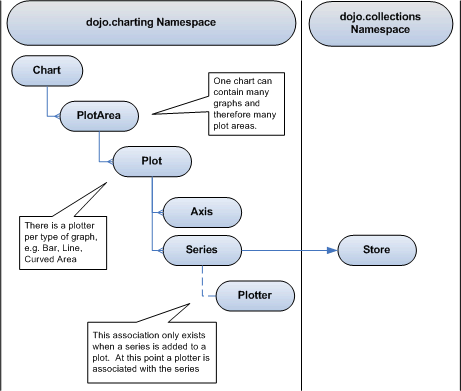
Como vemos de las relaciones existentes en el diagrama ellos permiten la habilidad de dojo de pintar multiples tipos distintos de gráficos, utilizando distintos plotters en una sola area de plot. Tambien tienen diferentes implementaciones para VML y para SVG tanto en los objetos Axis, PlotArea y Plotter.
El ejemplo
Empecemos referenciando dojo y las librerias requeridas:
<script type="text/javascript" src="dojo/dojo.js"></script>
<script type="text/javascript">
//Include the required dojo libraries/namespaces
dojo.require("dojo.collections.Store");
dojo.require("dojo.charting.Chart");
dojo.require('dojo.json');
</script>
Ahora definamos o recuperemos los datos con los que alimentaremos nuestra gráfica en una collection store. Se añaden a la gráfica como series, definidos asi:
var exampleData =
	[
	{ time: 10, count: 7382 },
	{ time: 20, count: 1852 },
	{ time: 35, count: 2397 },
	{ time: 50, count: 1442 },
	{ time: 55, count: 1854 }
	];

var store = new dojo.collections.Store();
store.setData(exampleData);

var timeSeries = new dojo.charting.Series({
	dataSource: store,
	bindings: { x: "time", y: "count" },
	label: "Example Series"
});
Ahora vayamos con la definiciones de los ejes donde podemos especificar el rango de display, el origen de datos y las etiquetas de los ticks de los ejes:
//Define the x-axis
var xAxis = new dojo.charting.Axis();

//Set the upper and lower data range values
xAxis.range = { lower: exampleData[0].time, upper: exampleData[exampleData.length-1].time };

xAxis.origin = "max";
xAxis.showTicks = true;
xAxis.label = "Example chart";

//Setup the x tick marks on the chart
xAxis.labels = [
	{ label: 'First', value: 20 },
	{ label: 'Second', value: 25 },
	{ label: 'Third', value: 35 },
	{ label: 'Fourth', value: 50 },
	{ label: 'Fifth', value: 55 }
];

//Define the y-axis
var yAxis = new dojo.charting.Axis();
yAxis.range = { lower: 0, upper: 5000 };
yAxis.showLines = true;
yAxis.showTicks = true;
yAxis.label = "Time Taken";

//Setup the y tick marks on the chart
yAxis.labels = [
	{ label: "0s", value: 0 },
	{ label: "1s", value: 1000 },
	{ label: "2s", value: 2000 },
	{ label: "3s", value: 3000 },
	{ label: "4s", value: 4000 },
	{ label: "5s", value: 5000 }
];
Entonces definimos comos los datos serán mostrados definiendo el objeto Plot y asignandole las series con un pletter para pintarlas:
var chartPlot = new dojo.charting.Plot(xAxis, yAxis);
	chartPlot.addSeries({
	data: timeSeries,
	plotter: dojo.charting.Plotters.CurvedArea
});
Esto entonces necesita ser pintado dentro de un area especifica , asi que definimos el PlotArea para añadirle el Plot:
var chartPlotArea = new dojo.charting.PlotArea();
chartPlotArea.size = { width: 380, height: 170 };
chartPlotArea.padding = { top: 20, right: 20, bottom: 30, left: 50 };

//Add the plot to the area
chartPlotArea.plots.push(chartPlot);
Finalmente creamos la chart y le añadimos la PlotArea. La chart tambien necesita un elememto contenedor al cual se asigna el chart.node.
var chart = new dojo.charting.Chart(null, "Example chart", "This is the example chart description");
//Add the plot area at an offset of 10 pixels from the top left
chart.addPlotArea({ x: 10, y: 10, plotArea: chartPlotArea });

//Setup the chart to be added to the DOM on load
dojo.addOnLoad(function()
{
	chart.node = dojo.byId("GraphContainerArea");
	chart.render();
});
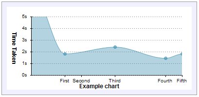
And voila, you have a graph that looks like this: