
The dojox.charting permite a los programadores crear gráfics funcionales, únicas y dinámicas desde varios conjuntos de datos. Además, dojox.charting proporciona varios themes y chart types que permite a los programadores mostrar sus datos de caulquier forman que gusten. En este tuto mostraremos como crear basic charts con variedad de datos, plots , ejes y themes.
- Dificultad: principiante
- Dojo Version: 1.6
Introducción
La libreria de gráficas de Dojo vive dentro del recurso “dojox.charting“. La colección dojox.charting único en lo siguiente:
- Permite crear charts con HTML (declarativamente) o con Javascript (programamaticamente)
- Funciona en todos los dispositivos
- Puede renderizar en SVG, VML, Silverlight y Canvas. Para que soporte SVGWeb se esta haciendo.
- Permite a los programadores decidir qué tipo utilizar
- Evalua el cliente y utiliza el render apropiado basandose en lo que el navegador del cliente soporta
- Crea gráficas con dojox.gfx, una libreria de gráficas vectoriales potente capaz de hacer que tus gráficas tengan animación en una amplia variedad de formas.
- Viene con una amplia variedad de themes atractivos
- Permite utilizar gradientes radiales y lineales dentro de los chart themes (que incluso funcionan en IE!!)
Antes de crear estas gráficas, es importante hacer los recursos que utilizará la gráfica disponible dentro de la página.
Configurar dojox.charting
Como para utilizar cualquier recurso de Dojo Toolkit, es importante que utilicemos “dojo.require” para cargar todas las dependencias. Dos dependencias que siempre son necesarias son el recurso de gráfica y el theme deseado:
// Require the basic 2d chart resource: Chart2D
dojo.require("dojox.charting.widget.Chart2D");
// Require the theme of our choosing
//"Claro", new in Dojo 1.6, will be used
dojo.require("dojox.charting.themes.Claro");
// Any plugins we choose to use would be required here as well...
Si tenemos una prioridad específica de renderizado preferida, es posible añadir un dojoConfig object que sea creado antes de cargar el Dojo:
<script>
dojoConfig = {
parseOnLoad: true, //enables declarative chart creation
gfxRenderer: "svg,silverlight,vml" // svg is first priority
};
</script>
<script src="/path/to/dojo/dojo/dojo.js"></script>
Con estas minimas dependencias cargadas ahora nuestra aplicacion web está lista para crear gráficas.
Creando un gráfica básica
De forma declarativa
Hay dos formas de crear un gráfica básica: declarativamente o programaticamente. Antes de crear la gráfica, sin embargo, es importante primero crear o acceder a los datos que la formarán. Los siguientes son unos datos de ejemplo que vamos a utilizar para crear nuestro ejemplo básico:
// x and y coordinates used for easy understanding of where they should display
// Data represents website visits over a week period
chartData = [
{ x: "1", y: "19021" },
{ x: "1", y: "12837" },
{ x: "1", y: "12378" },
{ x: "1", y: "21882" },
{ x: "1", y: "17654" },
{ x: "1", y: "15833" },
{ x: "1", y: "16122" }
];
Con los datos formateados apropiadamente y disponibles , una gráfica creada declarativamente se parece a algo como esto:
<!-- create the chart -->
<div dojoType="dojox.charting.widget.Chart2D" theme="dojox.charting.themes.Claro" id="viewsChart" style="width: 550px; height: 550px;">
<!-- Pie Chart: add the plot -->
<div class="plot" name="default" type="Pie" radius="200" fontColor="#000" labelOffset="-20"></div>
<!-- pieData is the data source -->
<div class="series" name="Last Week's Visits" array="chartData"></div>
</div>
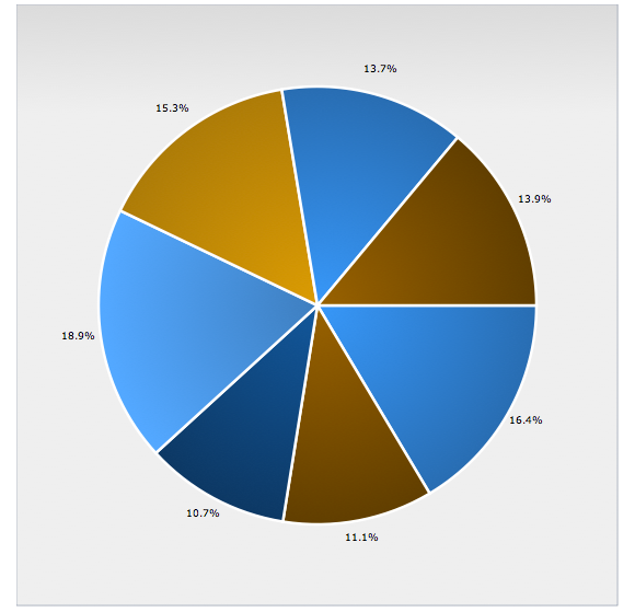
A pie chart usingthe Claro theme
El código entero del ejemplo anterior:
<html>
<head>
	<script>
		djConfig = {
			isDebug: true,
			parseOnLoad: true
		};
	</script>

	<script src="http://ajax.googleapis.com/ajax/libs/dojo/1.6.0/dojo/dojo.xd.js"></script>
	<script>
		// Grab the parser
		dojo.require("dojo.parser");

		// Require the basic 2d chart resource: Chart2D
		dojo.require("dojox.charting.widget.Chart2D");

		// Require the theme of our choosing
		//"Claro", new in Dojo 1.6, will be used
		dojo.require("dojox.charting.themes.Claro");
		// Any plugins we choose to use would be required here as well...

		// x and y coordinates used for easy understanding of where they should display
		// Data represents website visits over a week period
		chartData = [
			{ x: "1", y: "19021" },
			{ x: "1", y: "12837" },
			{ x: "1", y: "12378" },
			{ x: "1", y: "21882" },
			{ x: "1", y: "17654" },
			{ x: "1", y: "15833" },
			{ x: "1", y: "16122" }
		];

	</script>

</head>
<body>
	<h1>Prueba de Dojo Charting</h1>

	<!-- create the chart -->
	<div dojoType="dojox.charting.widget.Chart2D" theme="dojox.charting.themes.Claro" id="viewsChart" style="width: 550px; height: 550px;">
		<!-- Pie Chart: add the plot -->
		<div class="plot" name="default" type="Pie" radius="200" fontColor="#000" labelOffset="-20"></div>

		<!-- pieData is the data source -->
		<div class="series" name="Last Week's Visits" array="chartData"></div>
	</div>

</body>
</html>
Cuando creamos la gráfica de forma declarativa, los settings principales de la gráfica están dentro del nodo contenedor. Plots y series consiguen sus propios nodos con atributos de personalizacion conteniendo chart settings, como por ejemplo plugins y trozos de gráficas.
Nota importante: Aunque es ciertamente posible crear gráficas declarativamente, es altamente recomendado que los programadores los creen programaticamente. Todavia dojox.charting no soporta completamente los atributos “data-dojo” de Dojo 1.6
Programaticamente
Programaticamente la creación de gráficas requiere un poco de más código pero proporciona más estabilidad y control. La misma gráfica puede ser creada programaticamente con el código siguiente:
<script>
// When the DOM is ready and resources are loaded...
dojo.ready(function() {
	// Create the chart within it's "holding" node
	var pieChart = new dojox.charting.Chart2D("chartNode");
	// Set the theme
	pieChart.setTheme(dojox.charting.themes.Claro);
	// Add the only/default plot
	pieChart.addPlot("default", {
		type: "Pie",
		radius: 200,
		fontColor: "black",
		labelOffset: "-20"
	});
	// Add the series of data
	pieChart.addSeries("January",chartData);
	// Render the chart!
	pieChart.render();
});
</script>
<!-- chart will go here -->
<div id="chartNode" style="width: 550px; height: 550px;"></div>
View Demo
El código completo del ejemplo anterior es :
<html>
<head>
	<script>
		djConfig = {
			isDebug: true,
			parseOnLoad: true
		};
	</script>

	<script src="http://ajax.googleapis.com/ajax/libs/dojo/1.6.0/dojo/dojo.xd.js"></script>

	<script>
		// Grab the parser
		dojo.require("dojo.parser");

		// Require the basic 2d chart resource: Chart2D
		dojo.require("dojox.charting.widget.Chart2D");

		// Require the theme of our choosing
		//"Claro", new in Dojo 1.6, will be used
		dojo.require("dojox.charting.themes.Claro");
		// Any plugins we choose to use would be required here as well...

		// x and y coordinates used for easy understanding of where they should display
		// Data represents website visits over a week period
		chartData = [
			{ x: "1", y: "19021" },
			{ x: "1", y: "12837" },
			{ x: "1", y: "12378" },
			{ x: "1", y: "21882" },
			{ x: "1", y: "17654" },
			{ x: "1", y: "15833" },
			{ x: "1", y: "16122" }
		];

		// When the DOM is ready and resources are loaded...
		dojo.ready(function() {
		    // Create the chart within it's "holding" node
		    var pieChart = new dojox.charting.Chart2D("chartNode");
		    // Set the theme
		    pieChart.setTheme(dojox.charting.themes.Claro);
		    // Add the only/default plot
		    pieChart.addPlot("default", {
		        type: "Pie",
		        radius: 200,
		        fontColor: "black",
		        labelOffset: "-20"
		    });
		    // Add the series of data
		    pieChart.addSeries("January",chartData);
		    // Render the chart!
		    pieChart.render();
		});
	</script>
</head>

<body>
	<!-- chart will go here -->
	<div id="chartNode" style="width: 550px; height: 550px;"></div>
</body>
</html>
Asignando colores a la gráfica sin utilizar Themes
Se hace pasandole colores como atributos en el metodo addSeries:
chart.addSeries("Monthly Sales - 2009",chartData2,{ stroke: "red", fill: "pink" });
Themes de gráficas
La Libreria de Dojo charting proporciona varios themes para que elijan los programadores.Los Themes varian en complejidad visual: algunos themes utilizan colores hexadecimales mientras otros más complejos utilizan lógica avanzada para calcular gradientes radiales o lineales para asi mejorar el look.
Todos los Themes pueden ser encontrados dentro del recurso dojox.charting.themes. Los Themes son ficheros javascript con datos especificos del Theme que representan. Lo siguiente es el código que crea el Theme “Miami Nice”:
// “Provide” the resource
dojo.provide("dojox.charting.themes.MiamiNice");
// Require the Theme class which is used by all themes
dojo.require("dojox.charting.Theme");
// Create a basic new theme with a list of solid colors
(function(){
	var dxc=dojox.charting;
	dxc.themes.MiamiNice=new dxc.Theme({
		colors: [
			"#7f9599",
			"#45b8cc",
			"#8ecfb0",
			"#f8acac",
			"#cc4482"
		]
	});
})();
Hay temas más complejos disponibles.Un ejemplo sería el theme “Claro” que utiliza gradientes y fuentes customizadas:
dojo.require("dojox.gfx.gradutils");
dojo.require("dojox.charting.Theme");

// created by Tom Trenka
(function(){

	var dc = dojox.charting, themes = dc.themes, Theme = dc.Theme, g = Theme.generateGradient,

	defaultFill = {type: "linear", space: "shape", x1: 0, y1: 0, x2: 0, y2: 100};

	themes.Claro = new dc.Theme({
		chart: {
			fill: {
					type: "linear",
					x1: 0, x2: 0, y1: 0, y2: 100,
					colors: [
						{ offset: 0, color: "#dbdbdb" },
						{ offset: 1, color: "#efefef" }
					]
			},

			stroke:    {color: "#b5bcc7"}
		},

		plotarea: {
			fill:{
					type: "linear",
					x1: 0, x2: 0, y1: 0, y2: 100,
					colors: [
						{ offset: 0, color: "#dbdbdb" },
						{ offset: 1, color: "#efefef" }
					]
			}
		},


		axis:{
			stroke: { // the axis itself
							color: "#888c76",
							width: 1
			},

			tick: { // used as a foundation for all ticks
				color: "#888c76",
				position: "center",
				font: "normal normal normal 7pt Verdana, Arial, sans-serif", // labels on axis
				fontColor: "#888c76" // color of labels
			}
		},

		series: {
			stroke:  {width: 2.5, color: "#fff"},
			outline: null,
			font: "normal normal normal 7pt Verdana, Arial, sans-serif",
			fontColor: "#131313"
		},

		marker: {
			stroke:  {width: 1.25, color: "#131313"},
			outline: {width: 1.25, color: "#131313"},
			font: "normal normal normal 8pt Verdana, Arial, sans-serif",
			fontColor: "#131313"
		},

		seriesThemes: [
			{fill: g(defaultFill, "#2a6ead", "#3a99f2")},
			{fill: g(defaultFill, "#613e04", "#996106")},
			{fill: g(defaultFill, "#0e3961", "#155896")},
			{fill: g(defaultFill, "#55aafa", "#3f7fba")},
			{fill: g(defaultFill, "#ad7b2a", "#db9b35")}
		],

		markerThemes: [
			{fill: "#2a6ead", stroke: {color: "#fff"}},
			{fill: "#613e04", stroke: {color: "#fff"}},
			{fill: "#0e3961", stroke: {color: "#fff"}},
			{fill: "#55aafa", stroke: {color: "#fff"}},
			{fill: "#ad7b2a", stroke: {color: "#fff"}}
		]
	});

		themes.Claro.next = function(elementType, mixin, doPost){
													var isLine = elementType == "line";
													if(isLine || elementType == "area"){
															// custom processing for lines: substitute colors
															var s = this.seriesThemes[this._current % this.seriesThemes.length],
															m = this.markerThemes[this._current % this.markerThemes.length];
															s.fill.space = "plot";
															if(isLine){
																s.stroke  = { width: 4, color: s.fill.colors[0].color};
															}
															m.outline = { width: 1.25, color: m.fill };
															var theme = Theme.prototype.next.apply(this, arguments);
															// cleanup
															delete s.outline;
															delete s.stroke;
															s.fill.space = "shape";
															return theme;
													} else if(elementType == "candlestick"){
														var s = this.seriesThemes[this._current % this.seriesThemes.length];
														s.fill.space = "plot";
														s.stroke  = { width: 1, color: s.fill.colors[0].color};
														var theme = Theme.prototype.next.apply(this, arguments);
														return theme;
													}
													return Theme.prototype.next.apply(this, arguments);
		};

		themes.Claro.post = function(theme, elementType){
													theme = Theme.prototype.post.apply(this, arguments);
													if((elementType == "slice" || elementType == "circle") && theme.series.fill && theme.series.fill.type == "radial"){
													theme.series.fill = dojox.gfx.gradutils.reverse(theme.series.fill);
													}
													return theme;
		};
})();
Whether the theme you implement (or create) is basic or complex, implementing the theme within your chart couldn’t be easier. Simply require the resource and call “setTheme” on the chart:
// Require the theme of our choosing
dojo.require("dojox.charting.themes.Claro");
// Create a chart
var chart = new dojox.charting.Chart2D("chartNode");
// Set the theme
chart.setTheme(dojox.charting.themes.Claro);
You may use any number of themes on a given page. Want to learn how to create a custom chart theme for your web application? Read Dive Into Dojo Chart Theming.
Componentes de gráficas: Plots , Ejes y Series
Definir una gráfica básica e implementar su theme es bastante simple. El trabajo real viene cuando tenemos que definir plots, ejes y series. Cada componente tiene si proposito especial.
Los Plots
Uno de los principales objetivos de los plots dentro del dojox.charting es definir el tipo de gráfica que debe ser añadida y proporcionar los valores para ese tipo especifico de chart. Los tipos por defecto que incluye dojox.charting en gráficas 2D son los siguientes:
- Default – Universal line chart capable of rendering lines, fill areas under those lines, and placing markers at data points. This plot type is used if no plot type was specified when adding it to a chart.
- Lines – Basic line chart. Uses Default.
- Areas – Area under data line(s) will be filled. Uses Default.
- Markers – Lines with markers. Uses Default.
- MarkersOnly – Markers, sans lines. Uses Default.
- Stacked – Data sets charted in relation to the previous data set. Extension of Default.
- StackedLines – Stacked data sets using lines. Uses Stacked.
- StackedAreas – Stacked data sets with filled areas under chart lines. Uses Stacked.
- Bars – Horizontal bars.
- ClusteredBars – Horizontal bars with clustered data sets. Uses Bars.
- StackedBars – Stacked data sets with horizontal bars. Uses Bars.
- Columns – Vertical bars.
- ClusteredColumns – Vertical bars with clustered data sets. Uses Columns.
- StackedColumns – Stacked data sets with vertical bars. Uses Columns.
- Pie – The traditional pie chart.
- Scatter – Similar to MarkerOnly, yet capable of charting using gradient fields.
- Grid – For adding a grid layer to your chart.
You can see each chart type in action by visiting Dojo’s nightly charting tests.
Los Plots se añaden a las gráficas con el método addPlot, pasándole el nombre de la gráfica (generalmente “default” ) y opciones especificas del plot:
chart.addPlot("default",{
       // Add the chart type
	type: "Pie"
});
Algunas de las opciones de Plot estandars son:
- type – The chart type (Pie, Bars, Scatter, etc.)
- lines – Represents if lines should be added within the chart
- markers – Represents if markers should be added to data points within the chart
- areas – Represents if areas within the chart should be shaded
- shadows – Represents if shadows should be added to lines within the plot (ex:
{dx:4, dy:4}) - tension – Adds curves to lines within plots for added smoothness. Values can be:
- X – Cubic bezier lines
- x – Similar to “X” but assumes that the point set is closed (a loop). It can be used when plotting true XY data.
- S – Quadratic bezier lines.
- gap – Represents the number of pixels between bars
Después cada tipo de chart puede tener sus propias opciones. El tipo Pie , por ejemplo, tiene una propiedad radius que define el tamaño del radio del chart:
// Add the default plot
chart.addPlot("default",{
	// Add the chart type
	type: "Pie",
	// Add the radius size because it's a pie chart
	radius: 200 //pixels
});
Antes de crear la gráfica, es mejor tomarse un tiempo visitando la dojox.charting Reference Guide para ver que settings especiales y customizaciones están disponibles para la gráfica que tú necesitas.
Los Ejes
La mayoría de las gráficas personalizan sus ejes x e y. Un eje puede ser horizontal (por defecto) o vertical. Los ejes son añadidos a las gráficas con el método addAxis. El siguiente trozo de código añade los ejes x e y a una chart:
// Add the X axis
chart.addAxis("x");
// Ad the Y axis
chart.addAxis("y",{
	vertical: true // y is vertical!
});
// Add a custom "dw" axis
chart.addAxis("dw",{
	vertical: true,
	leftBottom: false
});
Algunas de las opciones de personalizacion de ejes mas usuales son:
- fixUpper – Aligns chart ticks (can be “major”, “minor”, “micro”, and “none”)
- fixLower – Aligns chart ticks (can be “major”, “minor”, “micro”, and “none”)
- leftBottom – Determines the side of the chart the axis is placed (default is
true) - min – The minimum number an axis can start at
- max – The maximum number an axis can end at
You can learn more about an axis’ settings including customization of colors, fonts, stepping, and precision here.
Las Series
Este elemento es simplemente una serie de datos a ser referenciados por la chart. Las series se añaden a la chart con el método addSeries. Este método acepta estos argumentos:
- name – The name of the series. Also represents the series label when the Legend plugin is used.
- data – The array of data
- options An object containing series options, which may include:
- stroke – Color and width of lines (ex:
{ color:"red", width: 2 }) - fill – Fill color of bar / line / pie piece
- stroke – Color and width of lines (ex:
Añadir una serie es tan fácil como esto:
// Add a simple axis to the chart
chart.addSeries("Visits",[10,20,30,40,50],{
	stroke: {
		color: "blue",
		width: 3
	},
	fill: "#123456"
});
// Add a multi-axes data series to the chart
chart.addSeries("Visits",[
	{ x: 1, y: 200 },
	{ x: 2, y: 185 },
	// and so on...
	],{
		stroke: {
			color: "blue",
			width: 3
		},
		fill: "#123456"
	}
);
Una chart puede tener cualquier numero de series solapantes.
Eventos de Chart
Los eventos de Chart te permiten enganchar un comportamiento a varias características de la chart, tales como las marcas en respuesta a acciones de usuarios.
Los eventos soportados son los siguientes: onclick, onmouseover, and onmouseout.
Los manejadores de eventos pueden ser enganchados a plots individuales de una chart:
chart.connectToPlot(
    plotName,    // el nombre del plot (el que se le dio cuando se creo)
    object,      // Tanto los parametros de object como el de methos son los mismos que los que se utilizan en el metodo dojo.connect()
    method       // Se puede poner una function sin object
);
| Attribute | Expected Value | Description | Since |
| type | “onclick”, “onmouseover”, “onmouseout” | differentiate between different types of events. | 1.0 |
| element | “marker”,”bar”,”column”,”circle”,”slice” | Indicates what kind of element has sent the event. Can be used to define highlighting or animation strategies. | 1.0 |
| x | number | The “x” value of the point. Can be derived from the index (depends on a chart). | 1.0 |
| y | number | The “y” value of the point. Can be derived from the index (depends on a chart). | 1.0 |
| index | number | The index of a data point that caused the event. | 1.0 |
| run | object | The data run object that represents a data series. Example: o.run.data[o.index] returns the original data point value for the event (o is an event handler’s argument). | 1.0 |
| plot | object | The plot object that hosts the event’s data point. | 1.0 |
| hAxis | object | The axis object that is used as a horizontal axis by the plot. | 1.0 |
| vAxis | object | The axis object that is used as a vertical axis by the plot. | 1.0 |
| event | object | The original mouse event that started the event processing. | 1.0 |
| shape | object | The gfx shape object that represents a data point. | 1.0 |
| outline | object | The gfx shape object that represents an outline (a cosmetic shape). Can be null or undefined. | 1.0 |
| shadow | object | The gfx shape object that represents a shadow (cosmetic shape). Can be null or undefined. | 1.0 |
| cx | number | The “x” component of the visual center of a shape in pixels. Supplied only for “marker”, “circle”, and “slice” elements. Undefined for all other elements | 1.0 |
| cy | number | The “y” component of the visual center of a shape in pixels. Supplied only for “marker”, “circle”, and “slice” elements. Undefined for all other elements | 1.0 |
| cr | number | The radius in pixels of a “circle”, or a “slice” element. Undefined for all other elements | 1.0 |
Ejemplos
Line Chart: Ventas mensuales
The Monthly Sales chart is a lines chart which features multiple axes and the “Tom” theme.
<script>
// Require the basic 2d chart resource: Chart2D
dojo.require("dojox.charting.Chart2D");

// Require the theme of our choosing
//"Claro", new in Dojo 1.6, will be used
dojo.require("dojox.charting.themes.Tom");

// Define the data
var chartData = [10000,9200,11811,12000,7662,13887,14200,12222,12000,10009,11288,12099];

// When the DOM is ready and resources are loaded...
dojo.ready(function() {

// Create the chart within it's "holding" node
var chart = new dojox.charting.Chart2D("chartNode");

// Set the theme
chart.setTheme(dojox.charting.themes.Tom);

// Add the only/default plot
chart.addPlot("default", {
type: "Lines",
markers: true
});

// Add axes
chart.addAxis("x");
chart.addAxis("y", { min: 5000, max: 15000, vertical: true, fixLower: "major", fixUpper: "major" });

// Add the series of data
chart.addSeries("SalesThisDecade",chartData);

// Render the chart!
chart.render();
});
</script>

<!-- create the DOM node for the chart -->
<div id="chartNode" style="width:800px;height:400px;"></div>
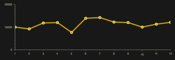
A line chart using the Tom theme
Stacked Areas Chart: Ventas Mensuales
Este ejemplo es una amplicación del primero pero añade un segundo eje para mostrar varios conjuntos de datos. Utiliza además el thme Dollar:
// Require the basic 2d chart resource: Chart2D
dojo.require("dojox.charting.Chart2D");

// Require the theme of our choosing
//"Claro", new in Dojo 1.6, will be used
dojo.require("dojox.charting.themes.Dollar");

// Define the data
var chartData = [10000,9200,11811,12000,7662,13887,14200,12222,12000,10009,11288,12099];
var chartData2 = [3000,12000,17733,9876,12783,12899,13888,13277,14299,12345,12345,15763];

// When the DOM is ready and resources are loaded...
dojo.ready(function() {
	// Create the chart within it's "holding" node
	var chart = new dojox.charting.Chart2D("chartNode");

	// Set the theme
	chart.setTheme(dojox.charting.themes.Dollar);

	// Add the only/default plot
	chart.addPlot("default", {
		type: "StackedAreas",
		markers: true
	});

	// Add axes
	chart.addAxis("x");
	chart.addAxis("y", { min: 5000, max: 30000, vertical: true, fixLower: "major", fixUpper: "major" });

	// Add the series of data
	chart.addSeries("Monthly Sales - 2010",chartData);
	chart.addSeries("Monthly Sales - 2009",chartData2);

	// Render the chart!
	chart.render();
});
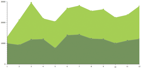
A stacked areas chart using the Dollar theme
Columns Chart: Monthly Sales
This chart builds on the original Line chart but instead uses columns. A 5-pixel gap is placed between columns; the MiamiNice theme is used.
// Require the basic 2d chart resource: Chart2D
dojo.require("dojox.charting.Chart2D");

// Require the theme of our choosing
//"Claro", new in Dojo 1.6, will be used
dojo.require("dojox.charting.themes.MiamiNice");

// Define the data
var chartData = [10000,9200,11811,12000,7662,13887,14200,12222,12000,10009,11288,12099];

// When the DOM is ready and resources are loaded...
dojo.ready(function() {
	// Create the chart within it's "holding" node
	var chart = new dojox.charting.Chart2D("chartNode");

	// Set the theme
	chart.setTheme(dojox.charting.themes.MiamiNice);

	// Add the only/default plot
	chart.addPlot("default", {
		type: "Columns",
		markers: true,
		gap: 5
	});

	// Add axes
	chart.addAxis("x");
	chart.addAxis("y", { vertical: true, fixLower: "major", fixUpper: "major" });

	// Add the series of data
	chart.addSeries("Monthly Sales",chartData);

	// Render the chart!
	chart.render();
});
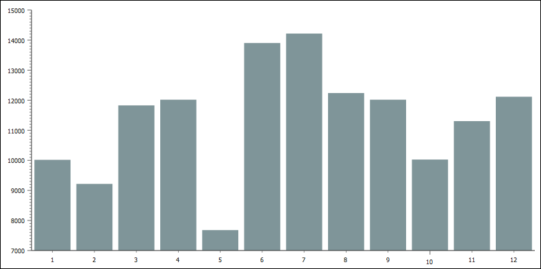
A column chart using the MiamiNice theme
Charting Plugins
The dojox.charting library provides functional and aesthetically pleasing plugins to enhance your forms.
Legend
Charts often include legends to further clarify the data provided within the chart. Using the dojox.charting.widget.Legend is easy: require the resource and create an instance, assigning it a chart:
<script>
	//this legend is created within an element with a "legend1" ID.
	var legend1 = new dojox.charting.widget.Legend({ chart: chart }, "legend");
</script>

<!-- create the DOM node for the chart -->
<div id="chartNode" style="width:800px;height:400px;"></div>

<!-- create the DOM node for the legend -->
<div id="legend"></div>
Tooltip
The Tooltip plugin pone luz sobre los valores que están por encima de las marcas, dependiendo del tipo de chart. Utilizando este plugin es tan facil como importar el plugin con require y crear una instancia enganchada a tu chart:
var tip = new dojox.charting.action2d.Tooltip(chart1, "default");
IMPORTANTE: Esto debe ser hecho antes de la llamada al render y después de añadir las series de datos.
NOTA: Veremos que se genera un div con estilos del tipo dijit_tooltip (http://dojotoolkit.org/reference-guide/dijit/Tooltip.html#dijit-tooltip)
MoveSlice and Magnify
Los plugins de MoveSlice y Magnify utilizan una animación para reaccionar al evento mouseover
The MoveSlice and Magnify plugins use a touch of animation to react to the mouse’s mouseover event. MoveSlice moves a pie chart piece and Magnify slightly enlarges chart markers. Both are implemented by creating a new instance and passing the chart and plot to it:
|
1
2
3
4
5
|
// Moves a pie slice: use the "pieChart" chart, and "default" plotvar slice = new dojox.charting.action2d.MoveSlice(pieChart, "default");// Magnifies a marker: use the "chart" chart, and "default" plotvar magnify = new dojox.charting.action2d.Magnify(chart, "default"); |
Like the Tooltip plugin, the MoveSlice and Magnify plugins must be assigned to the chart before the render method is called on the chart.
Highlight
The Highlight plugin changes the color of an area when the mouse enters the area:
|
1
2
|
// Highlights an area: use the "chart" chart, and "default" plotvar magnify = new dojox.charting.action2d.Highlight(chart, "default"); |
Monthly Sales with Legend, Tooltips, and Magnify
Let’s add the Legend, Tooltip, and Magnify plugin to a line chart:
|
1
2
3
4
5
6
7
8
9
10
11
12
13
14
15
16
17
18
19
20
21
22
23
24
25
26
27
28
29
30
31
32
33
34
35
36
37
38
39
40
41
42
43
44
45
46
47
48
49
50
51
52
53
|
// Require the basic 2d chart resource: Chart2Ddojo.require("dojox.charting.Chart2D");// Retrieve the Legend, Tooltip, and Magnify classesdojo.require("dojox.charting.widget.Legend");dojo.require("dojox.charting.action2d.Tooltip");dojo.require("dojox.charting.action2d.Magnify");// Require the theme of our choosing//"Claro", new in Dojo 1.6, will be useddojo.require("dojox.charting.themes.Claro");// Define the datavar chartData = [10000,9200,11811,12000,7662,13887,14200,12222,12000,10009,11288,12099];var chartData2 = [3000,12000,17733,9876,12783,12899,13888,13277,14299,12345,12345,15763];var chartData3 = [3000,12000,17733,9876,12783,12899,13888,13277,14299,12345,12345,15763].reverse();// When the DOM is ready and resources are loaded...dojo.ready(function() { // Create the chart within it's "holding" node var chart = new dojox.charting.Chart2D("chartNode"); // Set the theme chart.setTheme(dojox.charting.themes.Claro); // Add the only/default plot chart.addPlot("default", { type: "Lines", markers: true }); // Add axes chart.addAxis("x"); chart.addAxis("y", { min: 5000, max: 30000, vertical: true, fixLower: "major", fixUpper: "major" }); // Add the series of data chart.addSeries("Monthly Sales - 2010",chartData); chart.addSeries("Monthly Sales - 2009",chartData2); chart.addSeries("Monthly Sales - 2008",chartData3); // Create the tooltip var tip = new dojox.charting.action2d.Tooltip(chart,"default"); // Create the magnifier var mag = new dojox.charting.action2d.Magnify(chart,"default"); // Render the chart! chart.render(); // Create the legend var legend = new dojox.charting.widget.Legend({ chart: chart }, "legend");}); |
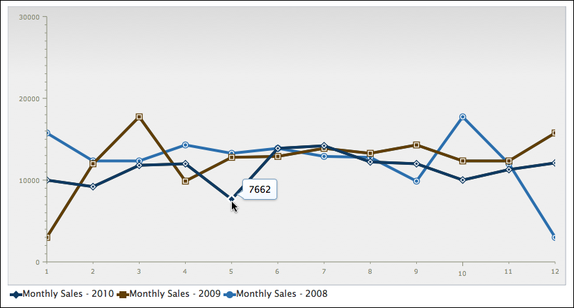 A line chart with a legend, tooltips, and magify enabled, using the Claro theme
Monthly Sales Pie Chart with MoveSlice
Add a bit of dynamism to your Pie Chart with MoveSlice:
|
1
2
3
4
5
6
7
8
9
10
11
12
13
14
15
16
17
18
19
20
21
22
23
24
25
26
27
28
29
30
31
32
33
34
35
36
37
38
39
40
41
42
43
44
45
|
// Require the basic 2d chart resource: Chart2Ddojo.require("dojox.charting.Chart2D");// Retrieve the Legend, Tooltip, and MoveSlice classesdojo.require("dojox.charting.action2d.Tooltip");dojo.require("dojox.charting.action2d.MoveSlice");// Require the theme of our choosing//"Claro", new in Dojo 1.6, will be useddojo.require("dojox.charting.themes.Claro");// Define the datavar chartData = [10000,9200,11811,12000,7662,13887,14200,12222,12000,10009,11288,12099];// When the DOM is ready and resources are loaded...dojo.ready(function() { // Create the chart within it's "holding" node var chart = new dojox.charting.Chart2D("chartNode"); // Set the theme chart.setTheme(dojox.charting.themes.Claro); // Add the only/default plot chart.addPlot("default", { type: "Pie", markers: true }); // Add axes chart.addAxis("x"); chart.addAxis("y", { min: 5000, max: 30000, vertical: true, fixLower: "major", fixUpper: "major" }); // Add the series of data chart.addSeries("Monthly Sales - 2010",chartData); // Create the tooltip var tip = new dojox.charting.action2d.Tooltip(chart,"default"); // Create the slice mover var mag = new dojox.charting.action2d.MoveSlice(chart,"default"); // Render the chart! chart.render();}); |
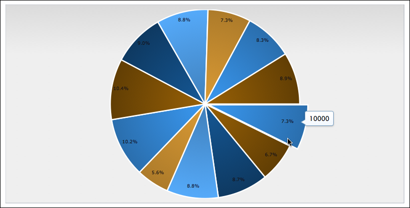 A pie chart with MoveSlice, using the Claro theme
Monthly Sales with Highlights
The Highlight plugin would look great with the Columns chart:
|
1
2
3
4
5
6
7
8
9
10
11
12
13
14
15
16
17
18
19
20
21
22
23
24
25
26
27
28
29
30
31
32
33
34
35
36
37
38
39
40
41
42
|
// Require the basic 2d chart resource: Chart2Ddojo.require("dojox.charting.Chart2D");// Require the highlighterdojo.require("dojox.charting.action2d.Highlight");// Require the theme of our choosingdojo.require("dojox.charting.themes.MiamiNice");// Define the datavar chartData = [10000,9200,11811,12000,7662,13887,14200,12222,12000,10009,11288,12099];// When the DOM is ready and resources are loaded...dojo.ready(function() { // Create the chart within it's "holding" node var chart = new dojox.charting.Chart2D("chartNode"); // Set the theme chart.setTheme(dojox.charting.themes.MiamiNice); // Add the only/default plot chart.addPlot("default", { type: "Columns", markers: true, gap: 5 }); // Add axes chart.addAxis("x"); chart.addAxis("y", { vertical: true, fixLower: "major", fixUpper: "major" }); // Add the series of data chart.addSeries("Monthly Sales",chartData); // Highlight! new dojox.charting.action2d.Highlight(chart,"default"); // Render the chart! chart.render(); }); |
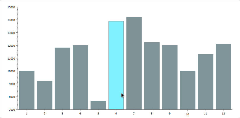 A column chart with highlight, using the MiamiNice theme
Conclusion
The Dojo Toolkit provides a complete charting library capable of creating elegant, eye-catching, and dynamic charts of various types. dojox.charting is unmatched by other charting libraries in flexibility, functionality, and extendability. Don’t serve your data to users in a boring way — dress up your data with dojox.charting!
dojox.charting Resources
Looking for more detail about Dojo’s charting library? Check out these great resources: