Making Animations work with Angular 4
With the release of Angular 4, the general syntax of Angular Animations didn’t change.
However, the animation functions were moved into their own package and you now also need to add a special module to your imports[] array in the AppModule.
Specifically, the following adjustments are required:
- You probably need to install the new animations package (running the command never hurts):
npm install --save @angular/animations
- Add the
BrowserAnimationsModuleto yourimports[]array in AppModule - This Module needs to be imported from
@angular/platform-browser/animations'=>import { BrowserAnimationsModule } from '@angular/platform-browser/animations'(in the AppModule!)
- You then import
trigger,state,styleetc from@angular/animationsinstead of@angular/core
That’s all!
Introduction
- Angular comes with a built-in animation module.
- It is hard to handle transition animation with only CSS in cases of render items in a list or conditional display of DOM elements . Thats why Angular provides this module.
Setting up the starting project
- We will start putting animation on a box below the buttons
- We will define states from where the transition will start and will end to.
Animations triggers and state and switching between states
- We will change the box from red to blue and move it to the right on the click of Animate button.
app.component.html
    <div class="col-xs-12">
      <h1>Animations</h1>
      <button class="btn btn-primary" (click)="onAnimate()">Animate!</button>
      <button class="btn btn-primary" (click)="onShrink()">Shrink!</button>
      <hr>
      <div [@divState]="state" style="width:100px; height: 100px;"></div>
    </div>
app.component.ts
import { Component } from '@angular/core';

import { trigger, state, style} from '@angular/animations';

@Component({
  selector: 'app-root',
  templateUrl: './app.component.html',
  animations: [
    trigger('divState',[
      state('normal', style({
        'background-color':'red',
        transform: 'translateX(0)'
      })),
      state('highlighted', style({
        'background-color':'blue',
        transform: 'translateX(100px)'
      }))
    ]
  )
  ]
})
export class AppComponent {
  state = 'normal';

	list = ['Milk', 'Sugar', 'Bread'];

	onAnimate() {
    this.state === 'normal' ? this.state = 'highlighted' : this.state = 'normal';
  }
	onAdd(item) {
		this.list.push(item);
	}

	onDelete(item) {
		this.list.splice(this.list.indexOf(item), 1);
	}
}
Transitions
- We will add now a transition between the two states, in one direction and in the reverse.
- Wit transition we define animation from one state to other and the duration as an argument of animate method (in milliseconds).
app.component.ts
@Component({
  selector: 'app-root',
  templateUrl: './app.component.html',
  animations: [
    trigger('divState',[
      state('normal', style({
        'background-color':'red',
        transform: 'translateX(0)'
      })),
      state('highlighted', style({
        'background-color':'blue',
        transform: 'translateX(100px)'
      })),
      transition('normal => highlighted', animate(300)),
      transition('highlighted => normal', animate(800)),
    ]
  )
  ]
})
Advanced transitions
- One simple way to define animation in both directions is with double arrow:
transition('normal <=> highlighted', animate(300)),
- We can use wildcards(*) to define transition from one state to any other:
@Component({
  selector: 'app-root',
  templateUrl: './app.component.html',
  animations: [
    trigger('divState',[
      state('normal', style({
        'background-color':'red',
        transform: 'translateX(0)'
      })),
      state('highlighted', style({
        'background-color':'blue',
        transform: 'translateX(100px)  scale(1)'
      })),
      state('chiquito', style({
        'background-color':'green',
        transform: 'translateX(0) scale(0.5)'
      })),
      transition('normal <=> highlighted', animate(300)),
      transition('chiquito <=> *', animate(300)),
    ]
  )
  ]
})
Transition Phases
- Now we can insert in-between animations. For instance , lets put an animation to border-radius 50px. To avoid hard step at the end we will add another animate method to transition to the end state.
- We will pass an array of animations to the transition method
- The first element of the array will be a starting style (background orange)
@Component({
  selector: 'app-root',
  templateUrl: './app.component.html',
  animations: [
    trigger('divState',[
      state('normal', style({
        'background-color':'red',
        borderRadius: '0px',
        transform: 'translateX(0)'
      })),
      state('highlighted', style({
        'background-color':'blue',
        borderRadius: '0px',
        transform: 'translateX(100px)  scale(1)'
      })),
      state('chiquito', style({
        'background-color':'green',
        transform: 'translateX(0) scale(0.5)'
      })),
      transition('normal <=> highlighted', animate(300)),
      transition('chiquito <=> *', [
        style({
          'background-color':'orange'
        }),
        animate(1000, style({
          borderRadius: '50px'
        })),
        animate(500)
      ]),
    ]
  )
  ]
})
The “void” state
- Regarding the cases of adding / deleting items in a list we can animate those actions with the void state.
- Let animate adding items by making the new items coming from the left and setting opacity from 0 to 1.
- And lets animate deleting items by making deleted items disappearing to the right
- We define a new trigger ‘list1’ to add into the <li> elements
- We don’t bind any variable of state in this case to the trigger. We will use predefined internal states for lists.
- ‘in’ state is a predefined state for elements inserted to the list
- ‘void’ state is the state for elements to be added.
app.component.ts
    trigger('list1', [
      state('in', style({
        opacity: 1,
        transform: 'translateX(0)'
      })),
      transition('void => *', [
        style({
          opacity:0,
          transform: 'translateX(-100px)'
        }),
        animate(300)
      ]),
      transition('* => void', [
        animate(300, style({
          opacity:0,
          transform: 'translateX(100px)'
        }))
      ])
    ]),
app.component.html
      <ul class="list-group">
        <li
          class="list-group-item"
          [@list1]
          (click)="onDelete(item)"
          *ngFor="let item of list">
          {{ item }}
        </li>
      </ul>
Using Keyframes for animations
- In case we want to set animations during the transition in specific steps we use keyframes.
- In this example we will define adding item action to the list with keyframes
- Lets define a new trigger ‘list2’ for that:
    trigger('list2', [
      state('in', style({
        opacity: 1,
        transform: 'translateX(0)'
      })),
      transition('void => *', [
        animate(1000, keyframes([
          style({
            transform:'translateX(-100px)',
            opacity:0,
            offset:0
          }),
          style({
            transform:'translateX(-50px)',
            opacity:0.5,
            offset:0.3
          }),
          style({
            transform:'translateX(-20px)',
            opacity:1,
            offset:0.8
          }),
          style({
            transform:'translateX(0px)',
            opacity:1,
            offset:1
          })
        ]))
      ]),
Grouping transitions
- Defining multiple animate methods in a array will execute sequentially.
      transition('* => void', [
        animate(1000, style({
          color:'red'
        })),
        animate(800, style({
          opacity:0,
          transform: 'translateX(100px)'
        }))
      ])
- But if we want multiple animate methods occurring at the same time (in parallel) we can use group method:
      transition('* => void', [
        group([
          animate(800, style({
            color:'red'
          })),
          animate(1000, style({
            opacity:0,
            transform: 'translateX(100px)'
          }))
        ])
      ])
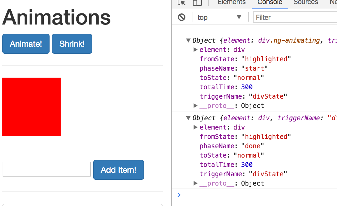
Using animation callbacks
app.component.html
      <div
        [@divState]="state"
        (@divState.start)="animationStarted($event)"
        (@divState.done)="animationEnded($event)"
        style="width:100px; height: 100px;"
      ></div>
app.component.ts
  animationStarted(event) {
    console.log(event);
  }
  animationEnded(event) {
    console.log(event);
  }
the result is: